This task is for us to analyse 5 known designers and their work as an element to design my work, my topic is Global Warming, the designers I'm interested in analysing are, David Carson, Kate Moross, Milton Glaser, Neville Brody and Storm Thorgerson.
David Carson
David Carson (born September 8, 1954) is an American graphic designer. He is best known for his innovative magazine design, and use of experimental typography. In particular, his widely imitated aesthet defined the so-called "grunge typography" era. His layouts featured distortions or mixes of "Vernacular"type faces and fractured imagery rendering then almost illegible.
In November 1995, Carson published his first book The End of Print. His second book, 2nd sight, followed in 1997. The third book that Carson published was Fotografiks (1999) which earned Carson the Award of Best use of Photography in Graphic Design. Carson's fourth book, Trek, was released in 2000
The resource available on: www.davidcarsondesign.com
Let's have a look at some of his work
I really like the "Grunge" style, his work has this interesting grunge style, either in typography and photography.
Let's have a look at my final designs with his element first.
Global Warming, the world will become warmer and warmer, in logic there wouldn't be snow anymore, Christmas is in winter, in those snowy days, with joy and happiness. If the world becomes warmer and warmer, the world will be a heat that the atmosphere in Christmas will be hot, boring and well-destroyed. So say bye bye to Christmas if we don't do anything about global warming.
The process of this one is easy, I took a photograph of an empty Christmas tree but with a Santa Claus hat on the top of the tree. An empty Christmas tree represents "boring Christmas" and a Santa Claus hat on the top of the tree represents Santa Claus abandoned his hat and decided not to go out to give presents anymore.
Santa Claus is waiting for the good atmosphere for him to go out to give Christmas gifts.
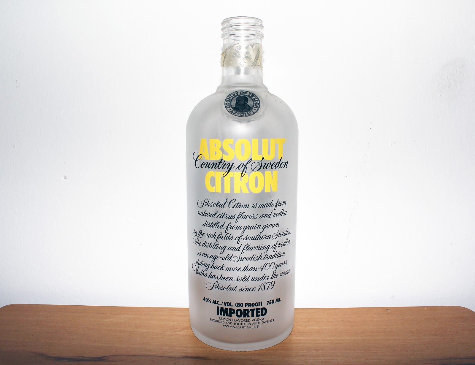
Russians drink lots of vodka is to keep warm in a very cold country, the world will become tropical everywhere that people in Moscow don't need Vodka anymore.
A similar process as Bye Bye Christmas, I took a photograph of an empty bottle of vodka.
and edited the image into this look
and added grunge style typos on the surface. I made a mistake on this one, that there are 2 "vodka" in this image, spelling mistake which let me know that the spelling and usages of language and grammar on the artwork or designs are very important.
The headline I first thought about is "They don't like vodka in Moscow anymore" but "like" is up to people, even though the world's becoming tropical, some people in Moscow would still like to drink vodka to get wasted, my point is that people in Moscow don't NEED vodka anymore, so I changed the headline to "Global warming makes Moscow stop drinking vodka" to make the headline neat in the image
The second known designer I analysed is Kate Moross.
Kate Moross is a designer and illustrator. Her achievements include a nationwide billboard campaign Cadburys and a signature clothing range for Top-shop. She is a 26 year-old graphic designer, the director of Studio Moross.
Reference: www.katemoross.com www.studiomoross.com
Let's have a look at her work.
She uses CMYK quite a lot.
She has this exaggerating and funky style of typography.
And she uses different lines and shapes to design.
She's very brave using bright colors.
I really enjoy the colors she uses, they make people's eyes have this bright feeling.
and now let's have a look at the posters I designed using her elements.
Palm tress are tropical trees, which represents the heat in terms of Global warming.
Process, I found a palm tree image online and traced it on AI
And added typos in the traced palm tree.
In logic there will be no snow in the future if we don't stop global warming, people won't know what snowflakes are in the future if there's no snow, so "Snowflake! What are you talking about?!"
I traced the shape of Snowflake
And used Kate Moross's LINE and SHAPE elements to create a special looking snow flake.
Then I added typos "BYE BYE SNOWFLAKE" which didn't make a point, snow flake will vanish in the world someday if global worming doesn't stop.
The typo "WHAT IS THAT" is too long to be the headline, the headlines are better to be as neat as possible.
the headlines and designs should always be in the middle, and shouldn't be at the edge of the poster in case the printed final work will be cut.
The next designer I Analysed is Milton Glaser.
Milton Glaser (born in 1929) is among the most celebrated graphic designers in the United States. He opened Milton Glaser Inc. in 1974 and continues to produce an astounding amount of work in many fields of design to this day.
Milton Glaser was born on 26th June 1929 in New York city, he is an American graphic designer, best known for the New York logo, his Bob Dylan poster, the DC bullet logo used by DC comics from 1977 to 2005, and the Brooklyn Brewery logo. He also founded New York Magazine with Clay Felker in 1968.
Milton Glaser Inc. was established in 1974 in Mahattan, and is still producing work in a wide range of design disciplines, including corporate identities, environmental and interior design, packaging and product design.
Reference: www.miltonglaser.com
Let's have a look at his work.
I heart NY, very well-known logo.
This one gave me an inspiration on designing Global Warming posters, which is called The End,
These are my work
"I don't heart Fish/Global Warming" I believe no one wants and likes global warming, global warming will cause raise in sea level, the only food we could eat in the future the the sea level has been risen up is fish and sea food, what people don't want in the future is fish, because there will be this day people gets bored of fish and starts to hate eating fish.
Process of this one is very easy I created the fish and NO sign on AI, the rest was typed on the surface.
We could identify Global Warming as an evil thing, evil is darkness, darkness is empty and unknown, and darkness could be the end of the world, but what will happen after the end of the world? No one knows, a comma instead of a period represents the end is coming with the darkness, what happens to the rest and afterwards is a mysterious question. And of course Global Warming is the creator of The End, and darkness.
First of all, I created a black back ground and typed the headline on it.
This is my first editing, and it's better to use minimum types of typos, in this poster I used 3 typefaces which make eyes optically messy.
So I tried to use 1-2 typefaces
Neville Brody
Neville Brody is an international renowned designer, typographer, art director, brand strategist and consultant. Brody is also the founder of the Research Studios network and partner in each of their operations.
Brody works both independently on private commissions and alongside Research Studios on commercial projects for a deverse range of clients.
He was born in London, Brody studied at the Hornsey School of Art and at the London college of Printing (LCP) where he's now a visiting professor.
In 1981 he became an art director at the groundbreaking street magazine. The Face, working there until 198, In April 1988 the VnA Museum (London) held an exhibition of his work to accompany his first monograph, The Graphic Language of Neville Brody, which became the world's best selling graphic design book. The exhibition toured extensively in Europe and Japan.
Research Studio (Neville Brody) Neville Brody Studio was renamed Research Studio in 1994, Research Studio now has a presence in Paris, Barcelona, Berlin and New York. Research Studio is a unique network who work from a wide variety of design platforms for a diverse range of international clients.
Neville Brody's work
Perhaps some of the most significant projects by Brody to-date have been the experimental languages, he has produced for typography publication, Fuse. He has designed many typefaces, Industria and Blur. Recent typefaces by Brody include "New Deal"
Reference: www.thefreedomspace.com
www.researchstudios.com
These are Brody's work
Now, let's have a look at my posters I designed.
The heat by global warming made me think of the fire truck light, and alarm, alarm for global warming, if we don't stop global warming, we will have to move to another planet in space.
Process
The heat by global warming makes snow men dress Bikinis, an ironic way to represent global warming.
Process 1
Process 2
Process 3
Storm Thorgerson
Storm Elvin Thorgerson (born in 1944) is an English graphic designer, best known for his work for rock bands such as Pink Floyed, Led Zepplin, Black Sabbath, Scorpions, Dream Theater, The Mars Volta and Muse.
Storm Thorgerson was born in Potters Bar, Middleset (now part of the Hertfordshire) and attended Cambridgeshire High School for boys with Syd Barrett and Roger Waters.
He went on to become key member of the graphic art group Hipgnosis, and designed many of their most famous single and album covers. In 1987, following the dissolution of Hipgnosis in 1983.
To quote Thorgerson, "I like photography because it is a reality medium, unlike drawing which is unreal. I like to mess with reality. Some of my works neg the question of is it real or not?"
Refernce: www.stormthorgerson.com
Storm Thorgerson's works are real and more of an optical illusion style, so based on my study field - photography I set a photoshoot to do the posters.
Global warming causes raise in sea level, fish generation will be more than humans, fish will eat humans instead humans eat fish.
Shooting Process
I tried to make up a model a fish, but optically, it doesn't really look like a fish.
Recycle to stop Global Warming right now! recycle is about reuse, we can reuse a bottle as a vase.
Shooting Process
These are the 10 posters I designed through 5 different designer's elements. Hope you like them.
Here are some sketches, mind map, concept and process


.jpg)
.jpg)