Some of the standard poster sizes are 8.5” x 11," 11” x 17," 18” x 24," 24” x 36,” and 27” x 40."
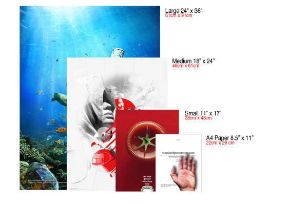
Smallest - 11” x 17”
This is the smallest standard poster size they are ideal for street lights, bulletin boards, and generally putting up on businesses without taking up too much room and offending. These also work the best with a minimalist approach to text. Big letters big message.
Medium - 18 “ x 24”
A little more information can be displayed on this standard poster size. I would still recommend some minimalism and little text. These posters are mainly seen as small adverts on university residence floors, doctor’s offices, construction walkways and bulletin boards.
Large- 24” x 36”
This is one of the most common standard poster size (Super A1). These posters are used for most applications including outside of events, trade shows, and malls. Also widely used for small movie posters delivered to fans and posters for decoration like in University residences and outside a pub or club. With these types of posters you will be grabbing attention with a large message and you can include further details in small writing so after the message is received people can choose whether to come closer and learn more.
Movie Poster Size
Movie poster size has enjoyed some of the most consistent standards within the industry and have benefited from collectors and the film industry’s standardization.
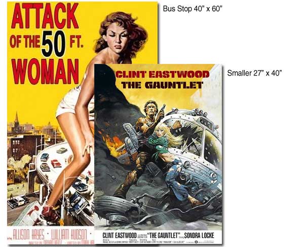
Most Common movie poster size – Portrait Format Poster - 27” x 40”
This is the most common standard poster size for movies used for advertising movies, collectors, and sometimes basement decoration.
Largest – Bus Stop Poster - 40” x 60”
This is the largest movie standard poster size before moving on to custom sizes they are most commonly used for bus stops.
ppi
ppi
In the context of image meta-data, PPI is only relevant for when you're going to print your images (at which point # pixels / PPI setting = physical dimensions of the printed image. – DA01 Jun 17 '13 at 20:57
The Tree Poster Design
I'd like to make this natural theme poster design simple, I created a shape of tree by montaging the photographs I captured and collected in the colour spectrum. Tree is probably the biggest plant on earth, a tree also could lighten the theme I chose in the beginning.
Poster
I have selected a background that's framed of dead leaves, and adjusted into very bright black and white colour on purpose to light the tree design piece in the middle, if I choose the back ground with its own colour and tones in the original coloured photography, the tree designed piece will not be able to be seen clearly and also to spot a shape of tree easily.
I created this entire poster in photoshop, I have selected 6 green coloured photographs from the colour spectrum I created and cropped them into circle shape, and ordered them together to have the look of tree leaves part on the top. At the tree trunk, it is created by ordering the brownish coloured photographs that I took and collected in the colour spectrum. The flowers on the tree are the photographs of different bright coloured flowers like red, purple, yellow and white to give the tree something to lighted the design.
Final Poster Design
To get a better poster, I have experimented with using different colour mixes to develop the entire poster design process. This time, I have sketched down of what's on my mind that was going to be seen in the poster.

Sketch
A very common logo in the world now: 7 edges marijuana leaf logo, it's been so many arguments between government's laws and people's supportive opinion about marijuana as something positive rather than drugs, and claim of marijuana as a type of plants instead of drugs. I consider this argument standing in between that the fact is marijuana is a type of plants, and it also effects on humans as drug effects and decreases human consciousness. With this two facts of marijuana's characteristics, I have decided to create a poster that tells the audience the both facts of marijuana through the poster.


Layer 3 as the template for filling images into the squares on photoshop later. Last week, I did the entire montage designing work on Illustrator involving photographs, and the file got 20GB enormous size, eventually it was even hard to reopen the file on Illustrator cause the massive size of the file. Therefore I have concluded that: when editing and working with photographs, use Photoshop is the best choice; when drawing and illustrating work, use Illustrator is the best choice. Layer 2 is the locked layer of the coloured stripes as the background.
After I build this template on Illustrator, I saved the file and reopened the file in photoshop; and created a new file in photoshop, size is 11"*17" poster size which is similar to A3 paper size. Selected the colour mode in CMYK for print.

Then I chose a photograph as the background to interact with the stripes I have created on Illustrator, then place the Ai file on top of the background layer, so that I have the interaction between colour strips and a black and white photograph of plants, and also the template for filling in photographs.


The outcome of filling into the template in squares has the look I expected, and looks more organised. I also have merged the flayers together into different colour categories. To organise the layers easily rather than have lots of the layers named by numbers which is quite confusing.


The outcome of the entire poster has the look, but at the pair of green leaves, they seem to disappear cause it's jointed with the green stripe and the, and the yellow leaf in the middle disappears in the yellow stripe. The colour mix of the entire poster might appear a little messy cause of the massive involvement of different more-than-7 colours. Then I planned to adjust the stripes into the colours that I have in the spectrum rather than adding more colours so the entire poster has the same colour theme: I did a little more editing in Illustrator.

In this poster design, I have used 5 bright colours to build the leaves in the logo: yellow, purple/pink, green, red and white, so according to this order, I have adjusted the strips' colours once again in Illustrator using the 5 bright colours I have mentioned above. I have deleted the template layer I created in Illustrator cause we already have the logo by using that template, the template I built in Illustrator is only used as an aid to create the logo by photographs.

I also have changed the background in photoshop to make the "pixelated" logo look more appearing in the poster. and adjusted the opacity of the Ai stripes to 80%.

I am still developing the poster to get the best and perfect one that I expect to see; I have set the background into black and white photograph to help the logo look more appearing. Also added texts to this poster.


References
Printaholic.com: http://www.printaholic.com/how-to-make-a-poster-in-photoshop/
Standard Poster Sizes: http://www.standardpostersizes.com/standard-poster-size/
Graphicdesign Stackexchange: http://graphicdesign.stackexchange.com/
Graphicdesign Stackexchange: http://graphicdesign.stackexchange.com/
No comments:
Post a Comment